
Wexly
An emotional support tool that assists you in managing emotions, achieving personal goals, and living empathically. With Wexly, we break down various emotional situations and walk you through a series of questions to help you gain a better understanding of your emotions and behaviors. Once you've written down several entries of journals, you'll be able to reflect on yourself and observe how you've grown along the process.
Content
You can click on the bullet points to jump forward to the sections you are interested in. Otherwise, enjoy the design process me and my teammate went through ;)


Background
While many schools are now implementing SEL(Social and Emotional Learning) into their curriculum, many adults have gone through life without knowing or understanding the benefits of SEL.
A lot of people go through life without the resources, confidence, or self-awareness to seek therapy or learn how to develop emotional growth skills. People who take the time to learn about SEL may notice a significant improvement in both interpersonal and intrapersonal interactions. Resulting in deeper connections with family, friends, and coworkers. This might also have a significant impact on how we communicate with and educate our young.

Our Goal
To create a space for adults to learn what type of questions they can ask themselves to come to a better understanding of how they react and think about difficult situations in their lives.

Setup
Team members / Role:
-
UX Desginer: Joe Chao (me)
-
UX Designer: Dan Mickulesku
Timeline: 20 days
Target Device: Mobile
Tool: Miro, Figma, Google sheet, Flowmapp, UsabilityHub
UX Tool: Competitive Analysis, Comparetivity Analysis, Persona, User Journey, Sketch, User Flow, Wire Flow, Wireframe, Low/Mid/High-Fi Prototype, User testing.


Project Plan
Based on the guideline our client gave us with the initial email, we planned out our project plan including the scope of this project, estimated time for our deliverables, and set up client meetings along the process to keep everything on the same page with our client. we scheduled a second zoom meeting to present our project plan.

Project Plan
Research Stage
During our zoom meeting, both the team and the client exchanged our opinions and fused our ideas into a new plan. With the project outline completed, we were able to go immediately into the research stage!
Comparative & Competitive Research
I started the project by doing research into understanding SEL and its potential opportunities with comparative and competitive research.
There is no shortage of apps on the market today that promote the benefits of mindfulness and self-care, and I wanted to make sure we were offering something unique and find out how we can make the most impact in this field. Made a feature inventory to discovered the features that have already been implemented in a handful of apps and found the possibility in journaling.
Therefore we really wanted to be sure to implement a space for guided journaling. Asking questions that would truly help a user reflect on 3 key areas.
-
What happened?
-
How they felt?
-
What did they need?

.png)
Feature Inventory


User Persona
Based off of our target users and research, This is John, a 41 year old small business owner from Denver. He grew up in a broken home without a steady parental figure. So as he’s gotten older, he is realizing he doesn’t have the social or personal skills that he should.
His goals are to be a better parent to his kids than he had, to understand himself more and more everyday, and to find a self-care resource that won’t break the bank.
He wants to feel that he is growing as a person, to have more meaningful relationships, and understand his behaviors better.
Pain points he has are: Self-help products are pricey, and calming methods like breathing and listening to mellow sounds don’t solve the underlying issues.

Persona
Ideation
Once we have a better understanding of our user needs and the directions we want to head to, we find the importance of journal, story, messaging, and mood check-in. we moved into the ideation phase by sketching out initial thoughts from me and my teammate.
Sketching
We sketched out our thoughts for each part we had in mind individually, then we shared our ideas and found the best out of them.
Our team ran into a process like a design studio, but without time constraints. I enjoy the process since it allows us to show the team our own visions in different aspects, and it is a fantastic method to express our ideas! Then, take the finest of us and put the pieces together.


Home Screen(top-left),
Emotion Card(top-right),
Journaling(bottom-left),
Saved Journal(bottom-right)

Messaging(top-left),
Message Details(top-right),
Story Reflection(bottom-left),
Messaging Details(bottom-right)


Story(top-left),
Story Detail(top-right),
Story Audio(bottom-left),
Guide Journal(bottom-right)

User Flow / Site Map
Moving on with the design process by sketching up a few flows and a site map of how we first envisioned designing the app. We had early plans to provide suggestions for emotional learning or random information regarding SEL domains.
.png)
Mood-Check-in process
.png)
Onboarding process
.png)
Site Map

Wireframes(1st Iteration)
Furthermore, we put up all of our first concept sketches into low-fi wireframes for how the flow of the app could work. As well as showing a few different ways we could display all of the tools.
-
Onboarding
-
Welcome
-
Mood check
-
Progress
-
Explore feelings and stories
-
Specific feeling
-
Journal calendar/ learn about emotions or SEL
-
Saved Journals/ Write a new entry
While making all the different pages, I also tried out the color that might work well with our product.

Onboarding

Explore feelings and stories

Welcome

Specific Feeling

Mood Check

Journal Calendar

Progress

Saved Journals

Wireframes(2nd Iteration)
The second iteration of the wire flow took a more instructional approach to the onboarding process. Moving into a mood status bar would give you user flow options based on your current mood.
In a bad mood? Here are our tools that can help with that mood specifically. Then, touched on how the journal page will present.


2nd Iteration of wireframes
Wireframes(3rd Iteration)
After a client check-in and with the client's expectation updates we adjust our directions to go for an MVP(minimum viable product) for our app. Getting rid of status check-in, messaging and stories to focus on the Journaling aspect.
These features didn’t directly help solve the problem of a user understanding their emotions.
We recognized we needed some kind of home screen at this point. Something that a user would recognize and would make them come back.


App close


App close


User Journey
While collecting more information in the direction adjustment, we did several user testing with our current version. Arrived at a user journey as below.
Our best tester, John! John enjoys the layout and is excited to see how the app works. Expecting to have a way to express his feelings, he quickly realized that a wrong button choice tells him to have a great day and shuts off.
He feels confused and goes back through the onboarding process, selects the “correct” button, and is able to complete a guided series of questions about a situation that upset him.
However, once again the app has run its course for this use case, and he is left confused by the meaning of the app.


User Journey
Final Version
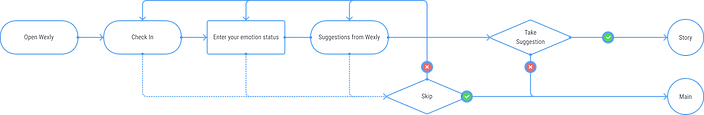
With the test result, we made our final adjustment on the app. Made a home page so that users can always refer back to it. Smooth out the process and updated our user flow. Also, introduce the font, size, color, components, backgrounds, and illustrations that are used in the app.

.png)
User Flow(final)


Font, Color, and Components

Illustrations
Prototype
Finally....here's the Figma prototype!


-
More Iterations
-
More Features
-
Business Model
Moving on with more iterations, testing, and more research. Adding notifications to check in on how users are, asking questions like “how do you feel?” “Anything upsetting you?” “How’s it going today?” Moreover, incorporate Stories, Messaging, and Check-In to further enhance the app. Finally, how do we sell this product? Pay for new content like more questions? Offer a limited amount of entries to be saved, then charge for a premium subscription? Or pay a one-time fee for full access to Wexly?
Next Step
Take Away & Final Thought
As a UX designer joins a project, it might not always start at the very beginning where we can/have time to go through all the research process. We might start at the point that the research part of the project is done, so what we can do is to adopt the process and carry on with what is next.
Even our project scope change multiple time along the process, what we as UX designer needs to do remains the same. Research, testing, and more testing will help you along the process.
I'd also want to say thank you to my incredibly AMAZING teammate: Dan Mickulesku for being AWESOME, open to all different ideas, and your great great UX writing.


