
Campground
Campground is a local business dedicated to helping its customers prepare and rent camping equipment for novice campers on their trip!
Timeline
1 week
Role
UX/UI Designer
Challenges:
Campground grows through the time of Covid where everyone is trying to get outdoors, away from the city. They are now working to offer online access more than just gear rental onsite, yet to help first-time campers better plan out their first advanture! I help to design the brand logo and create user-friendly site.
Comparative Research
I conducted comparative research as the first step of the research process to better understand what customers are looking for in similar businesses.
.png)
Comparative Research
Logo
For a rental business, I want to create a high-quality, clean, and simple logo for people who can easily remember and feels reliable and creditable. Also, the site should be comfortable, compelling, and cutting edge but not intimidating.

Proto - Persona
After picturing what the branding and the logo should look like, I started to figure out who should be our target users?
Because it is a rental business of camping tools, I believed our target customers are people who have limited experience of camping, like 0 - 2 years of experience, or for a large group of people, since it's hard for them to prepare the tools on their own. And that's when Campground comes in, to have the list of tools as a package for our customers not to worry too much about the gear but to enjoy their trip.

Proto-Persona: William

Proto-Persona: Sophia
Ideation
Moving into the ideation part by sketching out the outline of the landing page with annotation of what it should include mentioned above.
%20Landing%20Page%20(1).png)
Wireframe(Low-fi): part 1
%20Landing%20Page%20(2).png)
Wireframe(Low-fi): part 2
Color
Picking up the color is always the fun part for me. Having the right color combination can really make the site alive and compelling. I'm picking 3 colors, light yellow and dark blue as the background color or text color and orange as the highlight.
I came up with the color combination from the campfire in the dark originally. Try out some dark yellow and red as the flame but finally land on orange.
By figuring out the color while moving the wireframe into Mid-Fidelity, I confirmed more detail like where the titles, messages, photos, and captions need to be.

Colors
A/B Testing
Between Mid-Fidelity and High-Fidelity wireframes, I took 5 rounds of A/B testing into different sections to make sure between each different design, I got the cleanest and most comfortable looking for the users.

A/B Testing: Hero


A/B Testing: Welcome
A/B Testing: How

A/B Testing: Testimonials

A/B Testing: Package
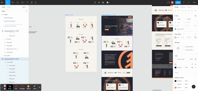
Wireframe
After everything settles down here's the landing page of Campground!
%20(4).png)
High-Fidelity Wireframe: Part 1
%20(4).png)
High-Fidelity Wireframe: Part 2
Next Step
Now that the landing page is done, I'm currently working on variations for different devices, and further on, we could move into building other pages and flows, like the actual rental process and how Campground can help the customers find the best value out of the business.


Variations of Nav.Bar & Breakpoints
Takeaways
The main takeaway from this project is that I find a better way of working on each section using component so that I can quickly check out how each different design of sections fit into the big picture.
Try Out Different Variations of How

